2020年4月15日星期三

Analysis on users and design requirements

Part one: User Analysis

A. students

1.       undergraduate
2.       postgraduate
3.       PhD
4.       Other major – like architecture students

B. Teachers ( May have multiple identities )

1.       Lecturer
2.       Researcher – experiment and research mainly
3.       Administration - administrative job
4.       Visiting scholar – a teacher from other school

C.  Support staff

     1.    Transporter - unloading from van or storage and transport to lab
     2.    Cleaner – cleaning the building and dirty container

Part two: Link of User and Function


1. Red means important moment 
2.“?” means no decision yet and should be discussed

Part three: Design requirements and Solution


 "T" shorts for hidden trouble
 "S" shorts for possible solution


1. Main entrance: 

         For those who come for the first time, a good first impression is very important
T: Lack of sign and guidance, which makes people lost.
S: Guided by a sense of space, the route should be intuitive and clear.Add signs or feature indoor decoration, such as combining display space


2. Tutorial space: 

          Lecture hall, tutorial lab, study room, etc. All places to learn knowledge from books or experiments
T: The classroom is too big to be heard or seen clearly in the back row.
S: Besides upgrading hardware facilities, reasonable classroom arrangements should be considered. Avoid a classroom that is too large.


3. Research lab: 

          Conditional labs with desks, chairs and experiment apparatus just like the lab in a science fiction movie
T: no idea. The labs are all the same around the world.
S: Integrate distance learning and VR experiment.


4. Single lab: 

          Specific function lab like green house, animal center or normal PhD project.
T: Many current single labs are simply separated from a large space, without considering the special needs of the experimental purpose
S: While retaining a certain amount of ordinary labs, consider the layout for special functions. Or set up a few templates that can be freely transformed


5. Office: 

          A small room with private pc for staff
T: no natural light. Too far away from labs.
S: consider location and lightening.


6. Pc rooms: 

         Many computers for students to finish their records or reports of the experiment
T: not enough pc for all the students to have one each.
S: Add more Pc rooms as they are more important nowadays.


7. Breakout space: 

          A place for all users to relax themselves, includes gardens.
T: sometimes too noisy.
S: Keep open and energetic without disturbing others


8. Work plants: 

          No idea at all.


9. Storage:

          Place to store the equipment and supplies. Should be big enough.


10.   Support staff entrance: 

          Avoid crossover between support staff and other users
T: the corridor may be too narrow for transportation
S: make sure it is wide enough for the biggest equipment such as fridges.


Chapter 7 - Learning in the landscape

This is an excerpt of chapter 7 from <Building School>

All the pictures are directly from ppt, click to see the clear ones.


Readings 2-3: Perez-Gomez and Johnson Q&A

    "Seeing is Believing but Feeling's the Truth"
    It is testament to the dominance of vision in contemporary society that this well-known phrase is often only remembered as "seeing is believing" (ref). (Links to an external site.)
    We know from previous readings that architectural experiences are more than visual - they are syneasthetic (Links to an external site.) and involve the whole motive body.
    Given the importance of taking these non-visual bodily sensations into account, how might we better integrate these elements into our architectural designs and presentations (especially given the current situation and the reliance on digital, and in particular, visual mediums like Zoom and Unity)?

    Before discussing the possible solution in virtual space, let me first define what I mean by senses in architecture:


1. Vision: 

    There is no doubt that this is the most important part. Needless to say, many architectural theories and designs are visually advanced. When we stepped into a new building, we confirmed the space by our eyes first.


2.Touch:

    Touch is also very important. The first part is linked to different textures which are also closely connected with visual memory. We can distinguish rough concrete and smooth stainless steel by visual action, but that comes from our touching experience in the past time. The other part is the feeling of wind, temperature and other factors. A perennial windy and freezing courtyard is definitely not as popular as a breeze and warm one.


3. Hearing: 

    In the building, hearing is more related to activities rather than space. Most activities will make sounds, from classroom discussions to playing the piano in the lobby. The existence of sound can play a background effect which is also common in video and games. Taking the Falling water Villa as an example, the sound of flowing water confirms the residents that they are in nature without see the real stream with their own eyes. On the other hand, in some places where hearing is the main purpose, such as a concert hall. The calculation of echo and reverberation is one of the main subjects in architecture design.


4.Smell: 

    As far as my concerned, the smell in the building is often closely connected with the material, such as the fresh wood fragrance in the new wooden building, or the rust smell in the dilapidated factory building. Most modern buildings are odorless, however, in my former school, the animal breeding area of the Biological Building was particularly smelly, which made me have to bypass that building every time if possible.


5.Taste:

    No, I will not lick any iron or concrete surface in a building. Never.


    Back to the topic, among the four senses other than vision, I think the most worthy of discussion is the sense of touch in the visual medium. Let me talk about the other three senses first.


1.Hearing: 

    Hearing has been used more maturely in the virtual engine. In architectural rendering software such as Lumion and Mars, you can put customized music and set its range and attenuation. So that audience can hear different sounds when walking in different virtual space. There are many kinds of sounds inside the software, ranging from reading in the classroom, talking in the cafeteria, to singing of birds on the branches. In more professional areas, such as film and game production, the use of sound is more numerous. There are even dedicated companies specializes in recording various types of sound effects in the recording studio. In general, sound can help people better integrate into the environment presented by vision, which is called “synesthesia”.


2.Smell: 

   In China, there are some successful projects that study the connection between virtual reality and smell. The Scent Library (气味图书馆) is one of them, which uses chemical reagents to greatly reduce various real-world products. 

    However, in architectural design, smell is more considered in gardens and interior spaces design. It will bring additional labels related to the user's personal experience, which may not be what the architect expected. Therefore, when simulating a cafe in a virtual environment, it may be simpler and more effective to simply prepare some hot coffee and place it at the table nearby than to simulate the smell by complex virtual signal. This idea comes from “5d movie” theaters, where staff use perfume to simply simulate the obvious smell of forests, flowers, and oceans related to what is shown in the movie screen. 


3.Taste: 

    I don't think we will need to taste a building physically.


    The most worthy of discussion is to explore the practical significance of touch and the means of realization in virtual reality.
    In <The Eyes of the Skin: Architecture and the Senses> (Links to an external site.), author criticized the visual center theory and believes that the lack of humanity in contemporary architecture can be understood as a neglect of the body and sensations. At the same time, the author proposed that human history has not been ruled by vision. The original auditory and tactile systems have been gradually replaced. In this process, situational thinking is replaced by abstract thinking. Although it has priority, visual observation is often convinced by touch.
     With the development of the architectural era, architects like Corbusier, Gropius and Mies exemplified the characteristics of visual domination, which influenced architectural theory and perception of architectural forms, as well as the philosophy of architectural education.
    The author believes that touch is the "mother of senses". All senses, including vision, are extensions of touch, which is also the senses that integrate ourselves into the world experience. Life initially relies on touching. After the development of visual images, the process of understanding them is also based on touching experience.
    In conclusion, we use the entire body to watch, touch, listen, and measure the world, and these worlds of experience are centered on our bodies. Architectural design is not just creating visual temptations, but conveying intentions and guiding consciousness to return to its own existence. Habitat is the way of human existence, and experience is the perception of existence.

    In terms of current technology, the realization of simple touch in virtual reality has been successful. In some advanced labs, touching gloves can replace the handle to simulate the operation of real hands. In the near future, with the update of sensor technology, we can expect to feel the difference between different materials in virtual reality. These all depend on the continuous advancement of hardware technology.
    In terms of the current subject, the quality of the final rendering is the most important. The real material, the bumpy texture, and the multi-directional simulation of lightening. These near-realistic visual experiences can evoke our own internal memory of tactile sensation, thereby partially realizing the sense of touch. Take the comparison of the two pictures below as an example.


2020年4月13日星期一

A Comparison of Realtime Rendering Software like Unity and UE4


First of all, I will temporarily classify software such as unity, lumion, mars (光辉城市) and twinmotion(both based on ue4) into one category for analysis, which can be called real-time rapid rendering software.

Advantage:


1.  Time-saving:

   I used to use lumion when rendering samples in design process. Compared to render a picture for several hours, even to open the computer rendering all night in Vary, the speed of such software is self-evident, which gives the architects more time to think and improve the design.

2.  Good quality:

   Under the premise of proper settings, you can get a good visual effect. Especially the scenery of plants and water systems. For most cases, it is acceptable.

3.  Real-time modification:

  It enable us quickly modify the program on site and discuss with teachers or customers, greatly reducing the communication cost.

4.  Abundant special effects:

  We can process pictures easily and quickly to meet the needs of different situations.

5.  Simple to get started:

   Learning cost is very low compared to 3dsmax

6.   Virtual reality:

   We can quickly connect virtual reality devices to achieve space roaming. It will be more common in the future.


Disadvantages:


1.  Quality limit:

  The picture has an upper limit. If it is a competition or the final big picture, the performance ability of such software cannot meet the demand.

2.   Detailed background setting:

   The pursuit of results often requires detailed consideration of surrounding background settings.

3.  Fixed style:

   Most of them are cartoonish (Mars maybe slightly better). It cannot be used to express a specific desired style, such as a collage style.


In terms of classification,

1. The difference between special software and open source software (unity + ue4 vs. lumion + mars + twinmotion):

     We know that unity and ue4 are mainly used to make video games, so compared to other software that specifically displays architecture, the work required is greatly increased. The application of light source, material and cameras needs to be set from zero. The advantage is that the code is open source, you can set some judgment conditions according to your needs. For example, you can achieve the effect of transforming walls from wood to steel or an elevator that can be truly moved in unity, which can't be done in software such as lumion.

2. The difference between unity series and ue series (unity vs. ue4 + mars + twinmotion):

     There is no doubt that unity occupies an absolute dominant position in the development of mobile terminals, especially mobile games and vr games. Because it is easier to learn, and the supporting assets store is also rich in content. The configuration requirements are also much lower than ue4. But the effect of ue4 is obviously better, and there are more possibilities for the cooperation of blueprint and c ++ language, which is not available in unity. This is why software such as mars and twinmotion chose ue4. By the way, lumion uses quest3d.
indoor render in unity from official website
indoor render in ue4 from personal production

Personally, I think Mars built on ue4 (I haven't used twinmotion which should be similar) is the main direction in the future. Its designers take into account most of the architectural display. Architects can quickly produce simple animations. The camera movement of the building roaming is also very convenient. Its material editor and lighting are also very comprehensive and practical.

Overall, both the rapid rendering software and 3dsmax are used to present architectural effects. The most important thing is the architectural design itself, because what we finally experience in person is the real space in reality.

Link Connection between Archicad and Grasshopper


Although the model in Rhino can also be directly imported into Archicad, the model thus completed cannot be edited in Archicad. Because it is based on GDL. In order to realize batch operation to save time and facilitate modification at the same time, you can directly use grasshopper and Archicad link plugin to complete Archicad modeling in Rhino.


0. Install related plug-ins.

    That is available on Archicad's official website, but pay attention to version issues, and the Rhino version of Archicad 23 link must be after sr14. Because I do not want to reinstall Rhino (can not be upgraded normally), I chose to link with version 22.

1. Draw the reference line 

    Draw the lines according to the original drawing or cad. The wall should be a single line, select the center of the reference line. The floor needs to be a closed curve. The column only needs the center point.

2. Set the grasshopper file. 

    There are ready-made calculators, which can be set directly. There are two methods to modify the settings. One is directly in grasshopper, but it is not easy to modify the settings as there are some missing options. Therefore, I chose to draw the desired wall in Archicad, and after changing the settings as I want, connect it back to grasshopper as reference to the calculators.

3. Start the connection
    Click the button. It will be displayed in both Rhino and Archicad windows

4. Add windows and doors. 

    As the specific framework of each window is not the same, even if it is all built in grasshopper, it needs to be modified one by one in Archicad. So I choose to manually model in Archicad directly. If there are many windows or doors that are all the same, I will choose to use grasshopper. The surrounding building is an example.

5. Add furniture. 

    At this point, grasshopper cannot be completed well, mainly because GDL is connected to the object. It is more convenient and quick to add it directly in Archicad.

Ex. Roof.

     There is a very convenient modeling method for the roof, you can directly change the flat surface in Rhino to the single-sided roof in Archicad. Because I have no roof in the modeling part this time, it is not used.

2020年4月12日星期日

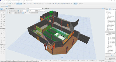
Pros and Cons of Archicad


      ARCHICAD is a new modeling software that I have come into contact with. It is very similar to Revit's modeling method, but it is easier to get started.

Advantages of Arhicad:


1. Smooth learning curve: 
    Very easy to get started, only a little more complicated than Sketchup. There are not many hidden settings like Revit, which is really difficult to master completely.

2. Rich custom space:
    The design freedom is much higher than Revit. But I generally choose to go back to Rhino and import it again

3. More suitable for architects:
    Revit was originally used for industrial design (as well as Rhino), more like engineer thinking. Arhicad designed specifically for architects fits with the design logic of architecture better.

4. Significant display:
    Arhicad can easily separate views and facilitate observation of different locations of the building, which has an advantage in showing the design results to the client. (However, Chinese clients generally only care about renderings and cost)

Disadvantages in China:


1. Concept stage: 
    Manual models are undoubtedly a good choice, but considering time and money costs, I will choose Rhino, Sketchup or Maya more often, corresponding to ordinary projects, simple projects or strange projects. Archicad's modeling is far less free and efficient than rhino.

2. Refinement stage: 
    In China, refinement will generally be carried out between the concept stage and the construction drawings stage. Revit is often involved gradually from this stage. As Autodesk's Autocad is the only software with 100% popularity in China. Revit, which can be well connected, has great advantages. On the other hand, Archicad has many restrictions on importing and integrating models from other software, especially Rhino and Maya.
3. Construction drawing stage: 
    Archicad has many inconveniences in connecting with other professions, such as water, electricity, heating and ventilation. I know little about that, just heard from my colleague who had worked together before

4. Construction stage: 
    That mainly depends on the construction teams themselves, so there is little difference between the two software.

Overall: Archicad is small and delicate,while Revit is large and comprehensive.

Ps. About teamwork, I think it needs to be improved. It often closes with errors and bugs. Even under normal circumstances there will be many unexpected errors, mainly from everyone has different settings and libraries.


Reading1 Pallasmaa | The Geometry of Feeling Q&A

Q1) His central point is that “the effect of architecture stems from more or less shared images and basic emotions connected with building.” (p.90)
To what extent do you agree with this?
Q2) If we agree with Pallasmaa and his attack on the architecture that privileges form and imagery...
What is the importance or significance of form in architecture?

I think as form in architecture, its significance is mainly in two aspects:

1.Physical level. 

        The form itself is expressed as content:as Pythagoras said,  “beauty itself is the proportion of numbers”. Therefore, in classical architectural forms, geometric methods such as symmetry and golden section show the beauty in the laws of nature. The Pantheon is an example. Its entrance space and main interior space follow the division of nine-square grids each. The huge circular dome aroused the ancient people's imagination of cosmic space.
      During the period of modernism, as Sullivan said,“form follows function”. Architectural forms are required to faithfully reflect structure and function. That is particularly evident in many buildings designed by Le Corbusier. However, I also have to admit that modernism overlooked the importance of function, and its popularity resulted to the fact that buildings around the world are always the same, which is also criticized by Pallasmaa in this article.But the form also inherits the classic geometry of the classical period by many great architects.
     The monopoly of modernism stems from the objective need for large-scale reconstruction after the war. However, it is undoubted to contradict humanity's different pursuit of beauty by completely resorting architecture to functionalism and attempting to provide standard answers of all dimensions with ergonomics,which promoted the emergence of postmodernism
      Sublime, geometric system and structural rationalism are the main meanings of architectural forms cross the age.

2.Spirit level

      “A great building must begin with the unmeasurable, must go through measurable means when it is being designed and in the end must be unmeasurable”-Louis Kahn
      The slogan of modernism was reversed by him: "Form evokes function" He believes that form conveys a sense of balance, which has nothing to do with the internal activities.Form itself became the purpose of existence, the origin of architecture. If it mixes real-life factors such as information, thought, enlightenment, it will no longer be pure. (I don't really understand this idea)
      You say to brick, “What do you want, brick?” Brick says to you, “I like an arch.” if you say to brick, “arches are expensive and I can use a concrete lintel over an opening. What do you think of that, brick?” Brick says: “I like an arch.” —Louis Kahn
      Kahn did not design the form first, but focused on expressing the characteristics of the material, and then came to the form.
      Take two examples seen on the Internet, using small material bricks as long-span arches. Then using a reinforced concrete beam to offset the side thrust. The beam was therefore unstressed, so the cross section of the beam could be small.
      The hole bolts on the concrete wall were retained. Although not good-looking, they were naturally left over during the construction process.
    
      I think the nature of architecture pursued by Kahn is the same as the shared images and motions explored by Pallasmaa. Even if people have different growth experiences, they will share something the same. Taking myself as an example, I have never lived in a rural hut, but I still yearn for it. This is deeply in the subconscious, inheriting the spirit of the millennium. After all, we have just walked out of the wooden shelter and stepped into the reinforced forest, just over a hundred years ago.